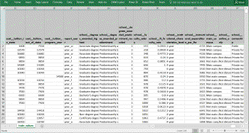
Our company acquired a data file containing over 15,000 rows and 300 columns. We are trying to identify patterns in the data. Where do we begin evaluating such a large dataset? Would Using R be helpful?
Let me answer that question by taking a look at data from the U.S. Department of Education known as the College Scorecard. This organization compiles a wide variety of measures for all colleges and universities in the United States. They track over 300 measures such as:
- Average SAT scores for incoming students,
- Percentage of students whose parents completed high school, and
- Whether the Institution is private or publicly owned.
I originally evaluated this data as part of a capstone course in the Microsoft Professional Program for Data Science. In that class, the overall goal was to identify a subset of these 300 measures that were most useful in predicting a single measure – the average income of graduates. Admittedly, it’s a bit overwhelming to know where to start resolving this sort of problem. You have intuitive hunches that SAT scores or faculty salary might be correlated to the future income of graduates. But how do you systematically evaluate a data set this large?
Using R #
In the rest of this article, I describe how 12 lines of R code were used to quickly summarize each of the 300 columns. The summary calculates two measures for each column in the Scorecard:
- The mathematical correlation of each column to the university’s average graduate income, and
- The extent to which the data was populated. This insight is important because though a variable may be highly correlated when it is known, it won’t be very useful if it is missing for 90% of the sample observations.
“I mostly follow you, But can you show me the result up front?” #
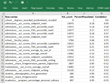
Absolutely – please take a look at the image shown at right. This is the summary data table that we’ll be creating. It shows a subset of those 300 columns; specifically the ~20 columns that had a greater than 50% correlation to income.
From it we can draw a few quick conclusions:
- school__degrees_awarded_predominant_recoded is an ideal predictor due to positive .60 correlation and being 100% populated
- admissions__act_scores_midpoint_math is also a strong predictor (.59) but offers less value to our study because only 18% of the data is populated for this column
- school__faculty_salary looks promising. It is populated for 66% of the dataset and shows a correlation of .55
“Ok - I can see how that is useful. How did you calculate that?” #
This summary of 300 columns and 17,000 observations was generated using the R language and the software RStudio (both of which are free.) The source code with embedded comments is shown at the bottom of this page. But if you are not already familiar with R, you may find this video walk-through more useful. It explains each step with incremental results.
College Scorecard data evaluated in R
“I’m a visual person – can R be used to graph data?” #
Please take a look at the graphic below. It is generated from this single R statement:
pairs.panels(train[c("lnincome","admissions__sat_scores_average_overall","school__instructional_expenditure_per_fte","student__size")])
You won’t be alone if you are scratching your head a bit with a first viewing of this chart. Just remember, this graphic shows the correlations between different numeric columns. The layout is similar to the grids you find on a road atlas. You know - the ones showing mileage between different cities. Instead of 2 cities, we are showing 2 data columns.
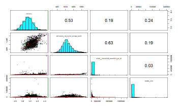
- Look at the intersections above the aqua-colored diagonal to learn the numeric correlation between 2 columns. In Excel terms, look at cell B1. It tells us that there is a .53 correlation between Income and Admission__sat_Scores_average_overall.
- View the intersection below the diagonal to see the visual scatterplot of how two numeric values relate to each other. Comparing those same two columns (column A2), you see a strong upward red trend-line within the scatter plot. Income and Admissions_SAT… are positively correlated.
- The aqua-colored diagonal itself shows the distribution of the variable and helps quickly tell you that the Instructional_expenditure and Student_size columns are not normally distributed. A stronger correlation might be discovered after transforming these 2 columns in some way.
What else can you glean from this visual?
- You may notice a strong correlation between Admissions_sat_scores…. and School_Instructional_expenditure… column (a value of 0.63 in column C2.)
- There are relatively insignificant correlations of student__size with other columns.
Once accustomed to viewing these, they convey a tremendous amount of information. And it’s kind of neat to know all of this was generated from a single line of R code.
A couple of additional thoughts: #
- Dealing with missing data is always a challenge. There are occasions when you want to substitute a mean or median value for missing values. The R routine below can be easily extended to calculate those reference values.
- The steps shown here are a good initial start for assessing a data set. Those straight correlations to your target variable are the logical place to start building a predictive model. But typically you will also look for more complex, multi-variable interactions that go beyond the summaries provided here.
- For the study in question, we exported all content to Excel (not just those correlating over .5). This Excel proved a useful location to annotate other findings for the columns as they were added to a regression model.
Summary of R #
This article demonstrates how the R language helps a data-intensive research project. R is uniquely designed to work with sets and achieves powerful results using concise syntax. For someone who has long used SQL to extract data, R opens up a whole new world of analysis and data interpretation. Perhaps you can think of novel uses of this tool in your organization.
Source Code #
Here is the code shown in the video.
# Read in the College Score card data into data frame named "CollegeScore"
load("SourceData/CollegeScore.Rdata")
#
# The line immediately below creates a 1-column vector "df_na_count" with the count of
#   missing observations (ie. those that are "not-available") for each column in our data set
df_na_count < - sapply(CollegeScore, function(y) sum(length(which(is.na(y)))))

# Let's convert the vector created above to a data-frame, that will allow us to
#   start adding columns in subsequent steps
df_na_count < - data.frame(df_na_count)

# In order to calculate % of rows populated, we'll need the total count of records.
#   Use the nrow function and store that to variable named "CS_rows"
CS_rows < - nrow(CollegeScore)

# Now calculate the percentage populated and bind that as a new column to our original data frame
df_na_count < - cbind(df_na_count, "PercentPopulated"
     = round((CS_rows - df_na_count$df_na_count) / CS_rows,2))

# Calculate the correlation of each column to our dependent variable - log(income)
# These statements use the "dplyr" package, "piping" each result to the next command via %>%
df_corr < - CollegeScore %>% select_if(is.numeric) %>%
     mutate_all(funs(cor(CollegeScore[,"lnincome"], ., use="pairwise.complete.obs"))) %>% slice(1)

# "df_corr" at this point is column oriented, we can quickly transpose that vector into rows
#    and round to 2 decimals via...
df_corr <- t(round(df_corr[1,],2))

# A quick cosmetic step to attach a column name....
colnames(df_corr) <- c("Correlation")

# And now merge the correlation data (in "df_corr") with our original data frame ("df_na_count")
df_na_count <- merge(df_na_count, df_corr, by.x = 0, by.y = 0, all.x=TRUE)

# Filter columns to those having greater than .5 positive or negative correlation....
#   ... and then sort them to show most highly correlated at the top
df_na_count <- filter(df_na_count, abs(Correlation)>.5) %>% arrange(df_na_count,desc(abs(Correlation)))

# Finally - write out our data frame to a Comma-Separated Value file we can sort / annotate in Excel
write.csv(df_na_count,file="Output/CollegeScore_NA_Correlations.csv")